Initially I was told to do the screen design in ... Enterprise Architect. Well that what they use in this shop, so I went along with it.
The problem: You can almost do screen design. But there are a lot of things you can do much better in EA: Class diagrams, sequence diagrams, you know it. So I ended up with a sloppy screen design that had few essential details in it and a bunch of real UML diagramms that the users couldn't care less. One user remarked: "Is this app gona run on Windows 3.11. The screens just look like it."
Well, when all you have is a hammer...
Then I remembered a tool whose main purpose was to do screen mockups. Its called Balsamiq Mockups. It is an Adobe Air application. So it runs on almost anything you can think of: Mac, Windows, Linux. The even have plugins for a couple of Wikis like Confluence and the like.
What took me a week with EA, I could redo in a day with the suggestions I got from the users. There are two reasons I can think of that made it so quick:
- It was the second time arround for me.
- Balsamiq Mockups focuses on screen mockups and nothing else.
So what I did is buying a license for Balsamiq Mockups Desktop and churned out screen designs like there is no tomorrow. Yes I bought the license myself, yes I installed unauthorized software on a company machine, yes I am dumb and I am guilty. But I just can't stand to being slowed down by some not so inspired company policies. If I get fired for this, I'll complain to Balsamiq.
The designs included a lot of tree views and what really hooked me for Balsamiq was the ease I could mock up tree view by entering text. Before that I was doing those mocks in Visual Studio by creating a form and mangling the controls on it until it looked right. I already told you that I am dumb, didn't I?
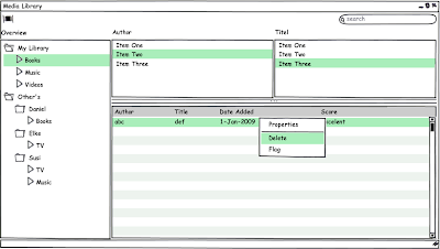
Here is a simple screen mockup that I created (not from my job at the company):

(Sorry for the bad image quality. It's the first time I uploaded an image to my blog.)
As you can see on the left hand side there is a tree view. To create that tree view I just had to enter
F My LibraryI wont go into the syntax. You can just look it up on their web site.
.>Books
.>Music
.>Videos
F Other's
.f Daniel
..>Books
.f Elke
..>TV
.f Susi
..>TV
..>Music
What really got me when I showed the stuff to my co-workers. Me the non-gui guy comming up with screens like I was some turtle-neck wearing design type.
First voices are heard about doing all the screen designs with this tool and buying some licenses.

No comments:
Post a Comment